
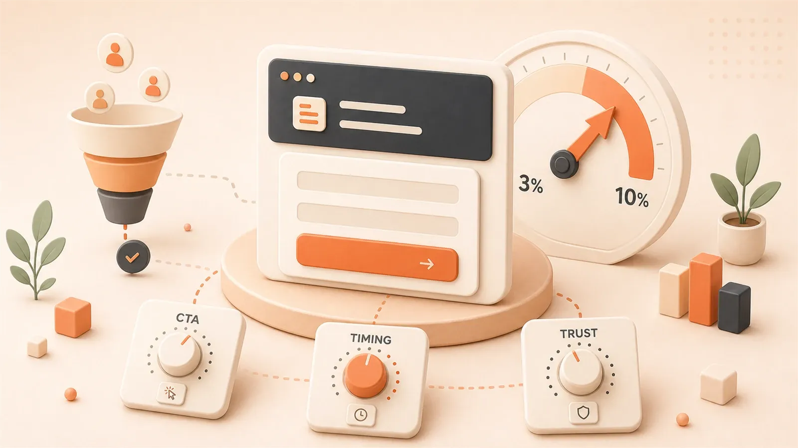
Tech Blog Conversion Rate Optimization: 7 Strategies to Boost Subscription Rates from 3% to 10%
Last year my blog averaged 500 PV per day. Subscribers? Nearly zero.
Analytics looked fine—people read—but almost no one left an email. The issue was not the writing; it was the funnel.
A survey of 80,000 independent sites put average popup subscribe rates at 2.3%–3.2%. About three signups per hundred visitors.
Optimized setups can pass 10%. That gap is roughly 3×.
This article shares seven tactics tested on real traffic—CTA design, subscribe flow, trigger timing, tooling—with numbers at each step.
Chapter 1: Face the Reality — Tech Blog Conversion Rate Benchmarks
Let’s start with some sobering data.
A 2026 survey covering 80,000 independent websites revealed that average popup subscription rates hover between 2.3% and 3.2%. Yes, that’s really all. To put it in perspective: out of 100 visitors, only about 3 might be willing to leave their email.
Even more sobering: data from 99firms shows that only 22% of businesses are satisfied with their conversion rates.
I used to be part of that 78% “unsatisfied majority.”
Back then, I naively thought that once traffic started flowing, subscriptions would naturally follow. The reality? 500 daily page views, and at the end of the month, my subscription list was empty. I triple-checked my tracking code, thinking I must have made a mistake—I hadn’t. The numbers were just that dismal.
The benchmark conversion rate for tech blogs hovers around 10%. What does that mean? Out of 1,000 visits, about 100 subscriptions. That’s the passing grade, not the honor roll.
If your blog’s conversion rate is below this number, don’t panic—this article is for you.
But here’s a crucial insight: traffic doesn’t equal conversion.
You might spend enormous effort on SEO, crafting viral headlines, distributing across platforms—but if visitors come and go without leaving a trace, that traffic is like water off a duck’s back—completely wasted.
Tech blogs have a special challenge: readers are more rational and more discerning. They won’t impulsively subscribe because of a flashy popup—they need tangible value. This means blindly copying e-commerce tactics like “limited time offer” or “sign up now” will likely backfire.
The good news? Because technical readers are more rational, once they recognize the value in your content, their loyalty tends to be high.
Let’s start with the fundamentals: CTA design.
Chapter 2: Four Elements of CTA Design — Making Buttons “Speak”
CTA (Call to Action) is simply that “Subscribe” button on your blog.
You might think, “It’s just a button, how much impact can it have?”
2026 statistics from wisernotify.com surprised me: clear CTAs can boost conversion rates by 161%. And personalized CTAs perform 202% better than generic ones.
That’s not just a button—that’s practically a money-printing machine.
So, what does a “converting” CTA look like? I’ve identified four key elements.
2.1 Copy: From “Subscribe to Us” to “Get Tech Weekly”
I made a mistake early on: my CTA button simply said “Subscribe to Us.”
Sounds fine, right? But put yourself in the reader’s shoes—“Subscribe to you? Why should I subscribe to you? What do I get?”
Technical readers need clear value propositions. When they see “Subscribe to Us,” they think: another marketing blog trying to harvest my email.
Change the copy to “Get Tech Weekly” or “Weekly Curated Code Snippets,” and conversion rates shift immediately.
My own test results: changing from “Subscribe” to “Get Tech Weekly” boosted click-through rates by about 40%.
2.2 Color: Contrast Matters More Than Color Itself
Many people obsess over whether the button should be blue or orange.
Here’s the truth: the color itself matters less than contrast. Can your CTA stand out from the surrounding content?
I’ve seen plenty of blogs where the CTA button color blends with surrounding elements—visually indistinguishable. Readers scan past without even noticing there’s a subscribe button.
A simple test: squint at your page. Can you still immediately spot the CTA button? If the answer is “not really,” your contrast isn’t strong enough.
2.3 Placement: Above the Fold + End of Article Reinforcement
Data shows that CTA placement can impact conversions by up to 70%.
What’s the best position? My experience says there are two must-have locations:
First position: Above the fold. Readers should see the subscribe option without scrolling. This could be in the top navigation bar or a fixed sidebar position.
Second position: End of article. After readers finish your article, if they found value, this is the moment they’re most likely to subscribe. Adding a “Found this useful? Subscribe for more” CTA here works surprisingly well.
2.4 Format: Popup vs. Sidebar vs. Inline
These three formats each have their strengths and weaknesses.
Popup: Highest conversion rate, but risks annoying visitors. If you use popups, you must control the trigger timing—we’ll cover this in detail later.
Sidebar: Doesn’t interrupt reading, but easily overlooked. Good for an “always present” subscription entry point.
Inline: Naturally inserted subscription cards within articles. Effect falls between the two, and doesn’t create reader friction.
My approach: use all three—sidebar as permanent presence, inline at article end, popup only triggered under specific conditions.
Chapter 3: Building a Subscription Funnel — Four-Step Path from Visitor to User
With CTAs in place, the next question is: what happens after visitors click subscribe?
If your answer is “they receive a welcome email,” you might be missing the entire funnel design.
A subscription funnel is essentially a four-step path: from stranger to subscriber, then to loyal reader, and finally potentially to paying customer.
Email marketing ROI can reach 36:1—for every $1 invested, you get $36 back. That’s the highest among all marketing channels. But the prerequisite is having a well-designed funnel.
Step 1: TOFU (Top of Funnel) — Making People Want to Stay
TOFU stands for Top of Funnel—the funnel’s entrance.
The core of this step: attract traffic with content, then “catch” that traffic with CTAs.
Many tech blogs get stuck here—great content, good traffic, but zero “catch” mechanism. Visitors read articles and leave, like shoppers who browse without buying.
You need to make readers realize: subscribing has value.
A simple approach: add a line at the end of articles like “This article is part of a series—subscribe to receive future updates.” Give readers a reason to stay.
Step 2: MOFU (Middle of Funnel) — Trading Value for Email
MOFU stands for Middle of Funnel.
The core here: offer readers a clear lead magnet in exchange for their email.
Lead magnets can be many things:
- A curated collection of code snippets
- A technical whitepaper
- A practical tool recommendation list
- A “subscriber-exclusive” deep-dive article
I saw a B2B case study that achieved a 48% form conversion rate using a 4P layout (Promise, Proof, Picture, Push). What does that mean? Instead of just dropping a form, they first promised value (Promise), demonstrated with case studies (Proof), painted usage scenarios (Picture), then drove action (Push).
Tech blogs can adopt this approach: tell readers what they’ll get after subscribing, use real examples to prove your content has value, describe scenarios where they’ll use this content, then drive them to enter their email.
Step 3: BOFU (Bottom of Funnel) — Building Trust with Welcome Sequence
BOFU stands for Bottom of Funnel.
After readers subscribe, don’t just send a single “welcome” email and call it done.
Design a welcome sequence: 3-5 consecutive emails that gradually introduce your content ecosystem, share your most valuable articles, and establish your professional credibility.
My welcome sequence looks like this:
- Email 1: Thank you for subscribing + a practical code snippet
- Email 2: Introduction to the blog’s content ecosystem and series
- Email 3: Share the most popular article
- Email 4: Ask readers a question (build engagement)
The purpose of this sequence isn’t to “sell,” but to make readers feel: this blogger is serious, this subscription has value.
Step 4: Ongoing Nurturing — From Subscriber to Conversion
This is the step many people overlook.
Subscribers aren’t the endpoint. You need to consistently send valuable content, keep them engaged, then introduce paid products or other conversions at the right time.
Common conversion paths for tech blogs: Subscriber → Paid course reader → Paid course buyer → Consulting client.
Chapter 4: Trigger Timing Optimization — The Invisible Factor More Important Than Design
Everything we’ve discussed so far is about what CTAs “look like.” But there’s a factor more important than design: when they appear.
I tested two popup timings:
- Popup 5 seconds after entering the site
- Popup after 80% scroll completion
The results surprised me: the second approach had a subscription rate twice as high as the first.
Data confirms this finding. An EDM case study mentioned that subscription rates from post-browse triggers can exceed 10%, while immediate popups not only perform poorly but also create friction with new visitors—actually reducing conversion rates by 5%.
Why?
Readers just landed on your blog. They don’t even know who you are yet, and you’re already popping up “Subscribe to Us.” Think about it—would you subscribe? Probably not. You might even close the page immediately.
Tech blog readers have another characteristic: they’re often looking for specific information. Like how to write certain code, or how to solve a particular bug. They opened your article with a goal: quickly find answers, not subscribe to a newsletter.
So, wait until they’ve “completed their task” or “discovered value” before triggering.
Trigger Timings Unique to Tech Blogs
I’ve identified several trigger timings that work particularly well for tech blogs:
Timing 1: Reading Progress Exceeds 80%
Readers who’ve finished 80% of the content are actually reading, not just scanning. Triggering a subscription invitation at this point yields noticeably higher conversion rates.
You can use JavaScript to monitor scroll position and judge reading progress.
Timing 2: Scroll to Code Block Area
Code blocks are core content areas in tech blogs. Readers spending time on code are seriously digesting your content.
Triggering subscriptions near code blocks works much better than random positions.
Timing 3: Click “Copy Code” Button
This is my favorite trigger timing.
Readers clicking copy code means your content is useful to them. A lightweight subscription prompt at this moment—“Liked this code snippet? Subscribe for more curated code”—works surprisingly well.
And this trigger doesn’t interrupt reading, because it only appears after readers take action.
How to Implement These Trigger Timings
If you’re using WordPress or Ghost, plugins can handle this. Tools like OptinMonster and Sumo have these features.
If your blog is a static site (like my Astro setup), you’ll need to write some JavaScript.
The core idea: monitor user behavior (scrolling, clicking), judge trigger conditions, then display subscription popups.
The code isn’t complex, but the effect is significant.
Chapter 5: Tool Selection and Configuration — Practical Implementation
With all these strategies, how do you actually implement them? What tools should you use?
There are plenty of email marketing platforms, each with pros and cons. I’ve compared several common ones for your reference:
| Platform | Use Case | Free Tier |
|---|---|---|
| Mailchimp | General blogs, small websites | 500 subscribers |
| ConvertKit | Content creators, paid courses | 300 subscribers |
| Buttondown | Minimalist newsletters, developers | 1000 subscribers |
| Substack | Standalone newsletter operations | Unlimited (but revenue share) |
My recommendation: start with platforms offering generous free tiers, then consider paid plans once you exceed the free limit.
Why I Chose Buttondown
Honestly, I tried several platforms. I finally chose Buttondown for simple reasons:
- Free tier of 1000 subscribers, enough for a long time
- Clean interface, no flashy unnecessary features
- Supports Markdown for writing emails—friendly for tech bloggers
- Can bind your own domain
ConvertKit is also good, more powerful, suitable for bloggers with paid products. But the free tier is only 300 subscribers, and the interface is a bit complex.
Substack is popular right now, but their model is “revenue share”—if you do paid subscriptions, Substack takes 10%. For bloggers just starting out, this might not be the optimal choice.
Configuration Essentials: Three Key Steps
After choosing a platform, comes configuration. Three steps matter:
Step 1: Event Tracking
You need to know where subscriptions come from. Which page drives subscriptions? Which CTA has the highest click rate?
Set up event tracking in Google Analytics: subscription form submissions, CTA clicks, popup displays. This way you can quantify optimization effects.
Step 2: Automated Welcome Sequence
As mentioned earlier, welcome sequences are key to building trust. Most email platforms support automated sequence configuration.
My sequence is 4 emails, spaced 1-2 days apart. You can adjust based on your content rhythm.
Step 3: Segmentation and Tags
As subscribers grow, you need to categorize them: which are development readers? Which are AI-focused? Which came from a specific article?
Segmentation tags let you send more targeted content instead of blasting all articles to everyone.
For example, I have a tag called “frontend development subscribers” for React and Vue content; another tag “AI tools subscribers” for ChatGPT and Claude tips.
This way subscribers receive content they’re interested in, leading to higher open rates and retention.
Chapter 6: Tech Blog Differentiation Strategies
The strategies discussed so far are largely borrowed from e-commerce and B2B marketing. But tech blogs have a special characteristic: reader behavior patterns differ.
I made a mistake early on.
When I first started optimizing subscriptions, I copied e-commerce tactics—limited time offers, scarcity language, “only 10 spots left.” The result? Subscription rates actually dropped.
Later I realized: technical readers don’t buy it.
Three Characteristics of Technical Readers
Characteristic 1: Rational Information Consumption
Technical readers won’t impulsively subscribe because of a flashy popup. They need to see tangible value—working code, feasible solutions, real case studies.
When you write “limited time offer” on a CTA, they’re thinking: what offer? Offer for what? What’s it to me?
Better to write directly “3 practical code snippets weekly”—that works better.
Characteristic 2: RSS Still Has Value
Many think RSS is dead. But in technical circles, RSS still has a loyal following.
After adding an RSS subscription option to my blog, I discovered some readers subscribe via RSS. They might not want to leave their email, but they’re willing to track updates via RSS reader.
So my approach: offer both email and RSS subscriptions. Let readers choose.
Characteristic 3: GitHub/Discord as Supplementary Channels
Tech blogs have another special channel: GitHub and Discord.
If your blog content has accompanying code repositories, you can put subscription links in GitHub READMEs. If your blog has community aspects, you can guide subscriptions in Discord channels.
Conversion rates on these channels might not match email subscriptions, but they help you reach readers who “only hang out in technical communities.”
Hybrid Strategy: Email + RSS + Community
My recommendation: don’t rely on a single channel.
Tech blog subscription paths can look like this:
- Email subscription: Core subscription channel, suitable for most readers
- RSS subscription: Supplementary channel, suitable for RSS users
- GitHub follow: Code repository companion, suitable for developers
- Discord/Telegram: Community channel, suitable for interactive readers
Multiple channels, multiple paths. Reader preferences vary—the more options you provide, the higher your conversion rate.
Chapter 7: A/B Testing Loop — The Scientific Method for Continuous Optimization
With all these strategies, you might wonder: how do I validate effectiveness? How do I continuously optimize?
The answer is A/B testing.
A/B testing is essentially: simultaneously test two versions, see which performs better. Then keep the better version and test the next variable.
It’s a loop: test → data → optimize → test again.
What to Test?
I’ve identified four key testing dimensions:
Dimension 1: CTA Copy
Test “Subscribe to Us” vs “Get Tech Weekly” vs “Weekly Curated Code Snippets.”
My test results: “Get Tech Weekly” had the highest click-through rate.
Dimension 2: CTA Color
Test blue vs orange vs green.
You might think orange is more eye-catching, but actual results depend on your page’s overall color scheme. If your page is dark-themed, blue might provide better contrast.
Don’t guess—test.
Dimension 3: Popup Timing
Test popup after 5 seconds vs 30 seconds vs 80% scroll completion.
My data: popup after 80% scroll completion had 2x the subscription rate of 5-second popups.
Dimension 4: Lead Magnet Type
Test code snippet collection vs technical whitepaper vs tool recommendation list.
This depends on your content type. If you write code tutorials, code snippet collections work better. If you write technical trend analysis, whitepapers might be more attractive.
How to Track Data?
A/B testing is inseparable from data tracking. You need to know:
- Which version has higher click rates
- Which version has higher subscription rates
- Post-subscription open rates and retention rates
For tools, Google Analytics can track clicks and form submissions. Email platforms provide open rates and click rates.
Connect these data points, and you’ll see a complete conversion path.
My Testing Rhythm
Here’s how I typically test:
- Only test one variable at a time (copy, color, timing)
- Run each version for at least 500 impressions
- After data stabilizes (3-5 days), choose the better version
- Then test the next variable
Don’t rush. Testing takes time, but results get increasingly precise.
Summary
With all this information, what should you actually do?
Here are three action steps:
Step 1: Audit Existing CTAs
Open your blog and see where subscription entry points are. Can you see them above the fold? Is there one at the end of articles? If not, add these two positions first.
Step 2: Choose an Email Platform
If you’re not using email marketing yet, pick a platform and start configuring. Buttondown’s free tier of 1000 subscribers will last you a long time. ConvertKit is more powerful, suitable for bloggers with paid products.
Configure a welcome sequence: at least 3 emails to build trust.
Step 3: Start Your First Test
Don’t change everything at once. Start with one variable—like CTA copy, changing from “Subscribe to Us” to “Get Tech Weekly.” Then observe data changes.
With data, you have direction for optimization.
Conversion rate optimization isn’t an overnight process. But once you start, results will gradually show. The difference between 3% and 10% is method, not luck.
FAQ
What's a normal conversion rate for tech blogs?
Where should CTA buttons be placed?
• Above the fold: Visible without scrolling, such as navigation bar or fixed sidebar position
• End of article: When readers finish the article, they're most likely to subscribe
Placement can impact conversions by up to 70%.
How should popup trigger timing be chosen?
• Reading progress exceeds 80%: 2x higher conversion rate than immediate popups
• Scroll to code block area: Readers are seriously digesting content
• Click "Copy Code" button: Shows content is useful, doesn't interrupt reading
Avoid immediate popups—they create friction with new visitors.
How to choose an email marketing platform?
• Buttondown: Free 1000 subscribers, clean interface, Markdown support, suitable for tech bloggers
• ConvertKit: Powerful features, suitable for bloggers with paid products, free tier of 300 subscribers
• Mailchimp: General blogs, free tier of 500 subscribers
• Substack: Standalone newsletter operations, but 10% revenue share model
Do tech blogs need to offer RSS subscriptions?
How many emails should a welcome sequence have?
• Email 1: Thank you for subscribing + provide immediate value (code snippets, resources, etc.)
• Email 2: Introduce content ecosystem
• Email 3: Share most popular article
• Email 4: Build engagement (ask questions or survey)
Space them 1-2 days apart, don't send all at once.
What dimensions should A/B testing cover?
• CTA copy: "Subscribe to Us" vs "Get Tech Weekly" vs "Weekly Curated Code Snippets"
• CTA color: Test contrast based on page's overall color scheme
• Popup timing: 5 seconds vs 30 seconds vs 80% scroll completion
• Lead magnet type: Code snippets vs whitepaper vs tool list
Test only one variable at a time, with at least 500 impressions per version.
15 min read · Published on: May 12, 2026 · Modified on: Jul 14, 2026
Content Marketing Complete Guide
If you landed here from search, the fastest way to build context is to jump to the previous or next post in this same series.
Previous
Brand IP Strategy: From Content Positioning to Fan Loyalty Loop
How to build a brand IP? The truth behind $37.1B creator ad spend. Deep dive into personalized values, high-frequency content, emotional redundancy, and the three-tier creator strategy.
Part 15 of 26
Next
User Growth Strategy: The Complete Journey from Acquisition to Retention
User growth isn't about buying traffic—it's about building a complete loop from acquisition to retention. This article breaks down the AARRR framework with actionable metrics and checklists.
Part 17 of 26
Related Posts
Technical Blog Quarterly Content Planning: Series Strategy & Pillar-Cluster Guide

Technical Blog Quarterly Content Planning: Series Strategy & Pillar-Cluster Guide
Series Updates and Hot Topic Patches: Practical Strategies to Keep Your Tech Blog Alive

Comments
Sign in with GitHub to leave a comment