
Stable Diffusion Prompt Template Guide: Product Photos, Avatars, Posters, and Game Assets
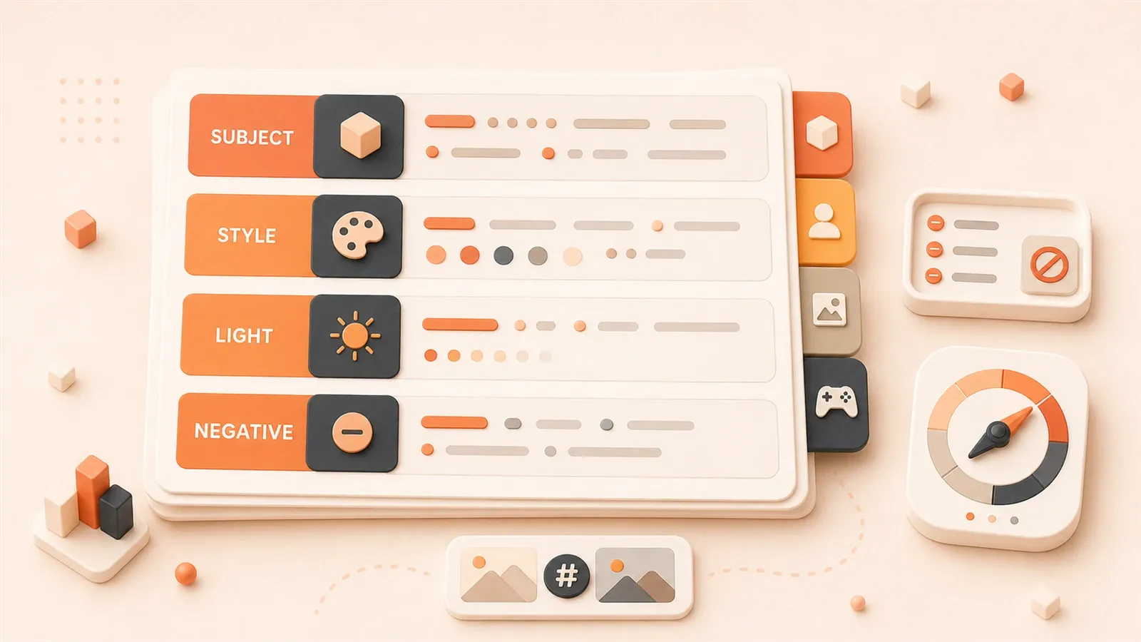
"Stability AI's Stable Diffusion 3.5 release page is used to confirm the SD 3.5 series positioning and prompt adherence background."
"The Stability AI License page is used to verify Community License and Enterprise License commercial use boundaries; as of 2026-06-23, the page still lists $1 million annual revenue as the key threshold."
"Hugging Face Diffusers documentation is used to confirm the foundational context for prompt, negative prompt, pipeline, and inference parameters."
"The ComfyUI Text to Image tutorial is used to confirm where the prompt sits in a text-to-image workflow and its relationship to basic nodes."
"The SDXL Base 1.0 model card is used to remind readers to check model cards, base models, and usage boundaries."
You copy someone’s successful Stable Diffusion prompt, and the result is twisted fingers, a broken face, and a composition completely off from what you expected. Many people assume it’s a model or parameter problem, but the root cause is missing a reusable structured approach: prompts aren’t keyword piles—they’re layered designs; negative prompts aren’t “the longer the better”—they’re reverse-optimized based on failure patterns; commercial use also requires checking model licenses and platform terms.
This prompt template guide covers four major scenarios—product photos, avatars, posters, and game assets—and breaks down weight syntax, iteration workflows, ComfyUI practice steps, and copyright boundaries.
A Prompt Is Not a Keyword Dump—It’s a Layered Design
Many people make one mistake when writing prompts: they see masterpiece, best quality, 8k, ultra detailed and copy it all, then add a pile of cinematic lighting, professional photography, award winning. The result is either a broken image or a style completely different from what you wanted.
The problem isn’t these words themselves—it’s that they’re all stacked at the same level, without layers for subject, scene, composition, style, and quality. The model receives a bunch of words with nearly equal weight, not a visual description with priorities.
The Correct Layered Structure
A stable prompt usually contains four layers, ordered from high to low priority:
| Layer | What to write | Required | Optional | Example |
|---|---|---|---|---|
| Subject layer | Core visual object | Subject + action/pose | Age, gender, clothing, expression | a woman sitting on a wooden chair |
| Scene layer | Environment and background | Location or space | Lighting, weather, time, atmosphere | in a cozy library, warm afternoon light |
| Composition layer | Lens and frame | Lens type or composition words | Angle, distance, negative space, crop | medium shot, from side angle |
| Quality layer | Technical and style constraints | Basic style words | Quality words, artist reference, render method | digital illustration, soft color palette |
Why this split? Because diffusion models’ attention mechanism prioritizes the front half of the prompt. Putting the subject layer first lets the model get the core object right. Scene and composition go in the middle to control the frame. Quality words go in the back half as style constraints.
Wrong vs. Right Examples
| Wrong example | Problem | Right example | Improvement |
|---|---|---|---|
masterpiece, best quality, 8k, beautiful woman, sitting, library, cinematic | Quality words steal the subject’s position—the model doesn’t know what to draw first | a woman sitting in a cozy library, warm afternoon light, medium shot, digital illustration, best quality | Subject first, layers ordered |
girl, cute, anime style, highly detailed, perfect face, white hair, blue eyes | Feature words mixed together, weight conflicts | a girl with white hair and blue eyes, anime style portrait, close-up, clean line art | Features grouped, style clear |
product photo, professional, expensive watch, luxury, gold, macro, sharp focus | Commercial words stacked, no concrete composition | a gold luxury watch on marble surface, macro product shot, shallow depth of field, studio lighting, high resolution | Product first, then shooting conditions |
These three examples show the same issue: more words isn’t better—clearer layers is better. Write what the subject is first; then where the scene is; then how the composition is framed; finally style and quality words.
Required and Optional Checklist for Each Layer
Subject layer required:
- 1 core object (person, item, building, animal)
- Basic action or pose (sitting, standing, walking, holding)
Subject layer optional:
- Age, gender, skin tone, body type
- Clothing, hairstyle, accessories
- Expression, eye direction, gestures
- Quantity (single, group, crowd)
Scene layer required:
- At least one location or space word (indoor, outdoor, street, forest, studio)
Scene layer optional:
- Lighting type (sunlight, soft light, hard light, neon)
- Weather, time (morning, night, rainy)
- Atmosphere words (calm, tense, cozy, cinematic)
- Background detail (simple background, busy background, bokeh)
Composition layer required:
- Lens type (portrait, medium shot, full body, landscape)
Composition layer optional:
- Angle (front, side, back, from above, from below)
- Frame (close-up, wide shot, cropped)
- Negative space direction (centered, left aligned)
Quality layer required:
- Basic style words (photography, illustration, anime, realistic)
Quality layer optional:
- Quality words (best quality, high resolution, detailed)
- Artist style (style of artist name)
- Render method (soft shading, hard edge, line art)
- Camera or device words (DSLR, film grain, HDR)
This layered structure isn’t an absolute rule, but it’s a stable template distilled from community practice. When writing a prompt, you can fill in this order first, then adjust for your specific scenario.
Weight Syntax and Blending Techniques
The layered structure solves “what to write and where.” But sometimes you need finer control: emphasize a word, blend two styles, or transition the image from one state to another. This requires weight and blending syntax.
Weight Syntax: Emphasize or Weaken a Word
The most common form is parentheses with a number:
(keyword:1.5)    # Increase weight to 1.5x
(keyword:0.8)    # Reduce weight to 0.8x
(keyword)        # Default weight ~1.1 (single parentheses)
((keyword))      # Default weight ~1.21 (double parentheses)
Practical example:
a woman sitting in a library, (soft lighting:1.3), warm atmosphereHere soft lighting has increased weight—the model will emphasize soft light. If you write:
a woman sitting in a library, (harsh lighting:0.7), warm atmosphereharsh lighting has reduced weight—the image may lean toward default lighting.
Weight isn’t “the higher the better.” Values above 2.0 often cause image collapse, color distortion, or detail loss. Generally, adjust between 0.7 and 1.5.
Blending Syntax: Two Concepts Alternating
Square brackets with a vertical bar let the model alternate sampling between two words:
[keyword1|keyword2]Example:
a [cat|dog] sitting on a chairThe model will use cat in some sampling steps and dog in others—the result may be an animal somewhere between a cat and a dog. This syntax fits style blending, like:
[anime style|realistic photography] portrait of a womanBut note: blending isn’t “half and half.” The result depends on sampling steps, seed, and the model itself. Sometimes it leans toward the first word, sometimes the second.
Gradient Syntax: Transition from One State to Another
Square brackets with a colon let the prompt switch during generation:
[from:to:0.5]The number 0.5 means after 50% of sampling steps, from is replaced by to. Example:
a [white:blue:0.3] dressFor the first 30% of steps, use white dress; for the remaining 70%, use blue dress. The result may be a white dress gradually transitioning to blue.

Gradient syntax is useful for action, expression, or style transitions, like:
a woman [smiling:crying:0.5]The first half uses smiling, the second half crying—possibly generating a transitional expression. But this syntax is model-sensitive; different checkpoints give very different results.
Syntax Support Differences Across UIs
Weight and blending syntax aren’t identical in all interfaces. Common situations:
| UI | (keyword:1.5) | [keyword1|keyword2] | [from:to:0.5] | Notes |
| --- | --- | --- | --- | --- |
| Automatic1111 WebUI | Supported | Supported | Supported | Most common syntax support |
| ComfyUI | Supported (in CLIP Text Encode node) | Supported | Supported | Enter text in the node to use |
| InvokeAI | Supported | Supported | Partial support | Gradient syntax may differ |
| Diffusers API | Manual implementation needed | Manual implementation needed | Manual implementation needed | Syntax must be handled at pipeline level |
If you use weight syntax in ComfyUI, write (keyword:1.5) directly in the CLIP Text Encode node’s prompt input box. No extra node or plugin needed.
Pitfall Reminders
-
Don’t stack too many weights: A prompt with 5+
(keyword:1.5)entries scrambles attention distribution and makes the image unstable. -
Don’t use blending for core subject:
[man|woman] sittingmay generate a gender-ambiguous person. If you clearly need one gender, write it directly. -
Gradient syntax needs enough steps: Too few steps (e.g., 10) may not show the gradient effect clearly. Generally use 20+ steps.
-
Weight syntax varies across models: The same
(keyword:1.5)may behave differently on SDXL vs. SD 1.5. Retest when switching models. -
Don’t exceed three parenthesis layers:
(((keyword)))weight is ~1.33; adding more easily spirals out of control. Use(keyword:1.5)with an explicit number for clarity.
Weight and blending syntax are fine-control tools—not mandatory. In most cases, a clear layered structure is enough. Use these only when you need to emphasize an element, blend styles, or create gradient effects.
Negative Prompt Isn’t “The Longer the Better”
A negative prompt tells the model “what not to draw.” Many people copy long “universal bad-word lists,” like:
low quality, worst quality, lowres, bad anatomy, bad hands, missing fingers, extra digits, cropped, blurry, text, watermark, signature, artist name, error, jpeg artifactsThese lists had some effect in the SD 1.5 era, but in SDXL and SD 3.5, negative prompt mechanisms have changed. According to Hugging Face Diffusers documentation, negative prompts affect classifier-free guidance (CFG) computation direction—overly long or conflicting negative words can make the model drift away from your expectation.
Three-Step Design Process
A more scientific approach is to add words backwards from the problem:
Step 1: Identify the problem from failed results
After generating an image, first judge where the problem lies:
| Problem type | Concrete symptoms | Corresponding negative words |
|---|---|---|
| Hand issues | Six fingers, twisted fingers, fused fingers | bad hands, mutated hands, extra fingers, missing fingers |
| Face issues | Eye position off, face deformed, asymmetrical features | distorted face, asymmetrical eyes, malformed face |
| Composition issues | Subject not centered, tight crop, frame unbalanced | cropped, off-center, bad composition |
| Style issues | Doesn’t match expected style, mixed rendering | anime, realistic, sketch, oil painting (write the style you don’t want) |
| Quality issues | Blurry, noise, low resolution | blurry, low resolution, jpeg artifacts |
Step 2: Add by category, don’t stack
Solve only one problem at a time. If this image has finger issues, add only hand-related negative words—don’t throw in quality, composition, and style words all at once. Example:
# Only hand problems
bad hands, mutated hands, extra fingers

# Only composition problems
cropped, bad composition, off-center
Regenerate after adding and observe. If hands improve but the face has issues, then add face words:
bad hands, mutated hands, extra fingers, distorted face, asymmetrical eyesStep 3: Control length, avoid conflicts
A negative prompt isn’t “the longer the better.” Generally keep it under 15-20 words. Beyond that, the model gets too many “don’t” instructions and doesn’t know what to do.
Avoid conflict words too. If your positive prompt has anime style, don’t put anime in negative—the model will get stuck. Negative words should be styles you don’t want to appear, not antonyms of your positive style.
Negative Prompt Templates for Common Scenarios
| Scenario | Recommended negative words | Notes |
|---|---|---|
| Realistic person | bad hands, mutated hands, extra fingers, distorted face, blurry, low quality | Focus on hands and face |
| Product photo | background clutter, reflection, shadow, watermark, text, blurry, cropped | Exclude background noise and artifacts |
| Anime style | realistic, photo, 3d render, low quality, bad anatomy, extra fingers | Exclude realistic and 3D elements |
| Interior design | person, cluttered, messy, low quality, blurry, watermark | Exclude people and messy backgrounds |
These templates are starting points, not fixed answers. Adjust based on your actual failure patterns.
Words Not to Stack
Some words are nearly useless or easily introduce new problems in negative prompts:
worst quality: Too extreme—the model may interpret “any quality is bad.”normal quality: Semantically vague—no one knows what “normal” means.artist name: Unless you explicitly don’t want a specific artist’s style, adding names reduces style diversity.watermark, signature, text: These may be useful, but too many make the model reject any text element—including poster titles you want.
A Practical Trick: CFG=0 to Check Pure Negative Effect
In the community, some people use CFG=0 to test negative prompt effects. When you set CFG to 0, the model completely ignores the positive prompt and generates purely from the negative prompt backwards. This lets you see what the negative words are actually excluding.
But this method isn’t for normal generation—it’s a debugging tool. Normally, CFG stays between 7-12, with positive and negative prompts working together.
Negative Prompt Differences Across Models
SDXL and SD 3.5 rely less on negative prompts than SD 1.5. Official model cards and Diffusers docs both mention that newer models have stronger prompt adherence—sometimes a positive prompt alone yields stable results.
If you still stack long negative words on SDXL or SD 3.5, you may limit the model’s expressive capacity. Start with a shorter negative prompt, then add incrementally based on failure results.
Four Scenario Templates: Product Photos / Avatars / Posters / Game Assets
The previous chapters covered general structure. This chapter gives direct templates for four common scenarios. Adjust for your actual use—you don’t need to write from scratch.
Scenario Breakdown Comparison
| Scenario | Use case definition | Lens choice | Negative space requirement | Spec boundary | Style example |
|---|---|---|---|---|---|
| Product photo | Product display, e-commerce hero image, detail page | macro, close-up, flat or slight top-down view | Space around edges, clean background | Size per platform, 1:1 or 3:4 ratio | White background, studio lighting, minimal |
| Avatar | Social media, personal brand, game character | portrait, close-up, centered composition | Space around head, avoid cropping face | 1:1 ratio, 512×512 or higher | Realistic, anime, illustration |
| Poster | Event promo, content cover, ad creative | wide shot, hero composition, centered or rule of thirds | Leave top space for title, bottom for logo | 2:3 or 9:16 ratio, high resolution | cinematic, bold color, dynamic |
| Game asset | UI elements, item icons, character sprites | Adjust per use: front view for icons, full body for sprites | Icons need clear outline, sprites need crop space | icon 256×256, sprite ratio varies | pixel art, anime, concept art |
Product Photo Template
Use case: E-commerce hero image, product detail page, product display.
Core requirements: Product clear, background clean, lighting even, no artifacts.
Prompt example:
a [product name] on white marble surface, macro product shot, shallow depth of field, studio lighting, clean background, high resolution, professional photography

Negative prompt:
background clutter, reflection, shadow, watermark, text, blurry, low quality
Adjustment points:
- Replace product name with your concrete object, like
a gold luxury watch,a leather handbag. - Background
white marble surfacecan becomesimple white background,wooden table,glass display. shallow depth of fieldblurs the background to highlight the product.- Negative space direction: if you need to add a logo later, write
centered, ample white spacein the prompt.
Avatar Template
Use case: Social media avatar, personal brand image, game character avatar.
Core requirements: Face clear, expression natural, style consistent, no cropping of key parts.
Prompt example (realistic style):
a [character description] portrait, close-up, looking at camera, soft natural lighting, shallow depth of field, high resolution, professional photography

Negative prompt:
bad hands, distorted face, asymmetrical eyes, blurry, low quality
Prompt example (anime style):
a [character description] anime style portrait, close-up, looking at camera, clean line art, vibrant color, high quality

Negative prompt:
realistic, photo, 3d render, low quality, bad anatomy
Adjustment points:
- Character description includes gender, age, hairstyle, clothing, expression, like
a young woman with short black hair, confident smile. looking at cameraensures eyes face the lens—fits avatars.- Realistic style uses
professional photography; anime style usesanime style, clean line art. - Recommended ratio 1:1, like 512×512 or 1024×1024.
Poster Template
Use case: Event promo, content cover, ad creative.
Core requirements: Visual impact, title-area negative space, main element centered or prominent, style consistent.
Prompt example:
a [theme description] scene, wide shot, cinematic composition, dramatic lighting, dynamic pose, bold color palette, high resolution, poster design

Negative prompt:
text, watermark, signature, blurry, low quality, cropped
Adjustment points:
- Theme description includes person, scene, action, like
a superhero standing on rooftop at sunset,a concert crowd with neon lights. wide shotandcinematic compositiongive a filmic feel.bold color palettesuits poster visual impact.- If you need to add a title later, write
top empty space for textin the prompt, or crop in ComfyUI after generation.
Note: Posters usually need post-compositing for titles and logos. The generated image is just base material. If you want a poster with text directly, try FLUX or SD 3.5—they support text elements better.
Game Asset Template
Use case: UI elements, item icons, character sprites.
Core requirements: Style consistent, outline clear, crop-friendly, fits game engine.
Prompt example (item icon):
a [item name] icon, front view, clean outline, simple background, pixel art style, bright color, 256x256, game asset

Negative prompt:
realistic, photo, complex background, blurry, low quality
Prompt example (character sprite):
a [character description] full body, anime style, dynamic pose, clean background, concept art, high resolution, character design

Negative prompt:
bad hands, extra fingers, distorted face, low quality, messy background
Adjustment points:
- Item icons use
front view, clean outlinefor clear outlines. - Character sprites use
full bodyfor complete figures. pixel art styleoranime styleadjusts per game type.- Game assets usually need later cropping, layering, and export. The generated image is step one.
Templates Are Not Fixed Answers
These four templates are starting points, not absolute standards. Different models, checkpoints, and LoRAs give different results. You can write your first prompt following this structure, then adjust based on actual output.
The key is remembering each scenario’s core constraints: product photos need cleanliness, avatars need frontal faces, posters need impact, game assets need crop-friendliness. These constraints matter more than specific words.
Model Impact on Prompts: Why Copying Others’ Prompts Gives Different Results
You may have faced this: you see a great prompt, copy it with the same parameters, and the result is totally different. Many assume it’s a seed or parameter issue, but the root is the model.
Prompt Adherence Across Different Models
| Model line | Prompt adherence characteristics | Style tendency | Impact on your prompt writing |
|---|---|---|---|
| SD 1.5 | Adherence weaker, easily dominated by quality words | Realistic, anime, illustration all have mature checkpoints | Need more specific words, quality words carry more weight |
| SDXL | Adherence stronger than SD 1.5, understands structure more accurately | Versatile, official base model leans realistic | Subject and scene words matter more, quality words can be fewer |
| Stable Diffusion 3.5 | Adherence markedly improved, better understanding of complex prompts | Official positioning as high-quality general model | Can write longer prompts—model still understands layers |
| FLUX.1 | Strong prompt adherence and image texture, better support for text elements | Photography feel, filmic, poster style | Can add text and brand-related elements in the prompt |
This table shows one thing: the same prompt gives different results on different models not because the prompt is wrong, but because models’ prompt understanding differs.
In the SD 1.5 era, many prompts stacked masterpiece, best quality, 8k because the model responded visibly to those quality words. In SDXL and SD 3.5, the model understands subject, scene, and composition better—writing clear visual content gives stable results. Quality words become auxiliary, not the lead.
How Checkpoints and LoRAs Change Effects
The “realistic portrait checkpoint” or “anime style checkpoint” you download is essentially a base model fine-tuned or merged. They change how the model responds to certain words.
For example, an anime-style checkpoint may respond stronger to anime style, vibrant color, clean line art but weaker to realistic photography, studio lighting. If you copy a realistic-style prompt onto an anime checkpoint, the image may be chaotic.
LoRA is more like an “add-on ability pack.” It makes the model learn a specific character, outfit, style, or concept. If you use a LoRA, match its trigger words in the prompt. For example, a cyberpunk style LoRA may need cyberpunk or specific keywords in the prompt to activate.
Troubleshooting Checklist When Prompt Gets Worse After Model Switch
If you hit “worse results after switching models,” check in this order:
| Check item | Possible problem | Fix direction |
|---|---|---|
| Base model line | SD 1.5 prompt put into SDXL or FLUX workflow | Switch to matching example workflow |
| Checkpoint type | Realistic prompt put on anime checkpoint | Switch to style-matched checkpoint |
| LoRA trigger words | LoRA used but prompt missing trigger words | Check LoRA model card, add trigger words |
| Prompt length | SDXL/SD 3.5 supports longer prompts, but SD 1.5 may not digest them | Simplify prompt, keep core subject and scene |
| Weight syntax | Different models respond differently to (keyword:1.5) | Lower weight range, retest |
| Negative prompt | New models rely less on negative words | Shorten negative prompt, keep only key exclusions |
| Workflow structure | New model may need different node chain | Use official or model-card recommended example workflow |
The core logic of this checklist: a prompt isn’t isolated text—it’s bound to model, checkpoint, LoRA, and workflow structure. When switching models, the prompt needs adjustment too.
A Practical Testing Method
When you get a new model, first test its response characteristics with a fixed prompt set:
# Test 1: Pure subject
a woman sitting on a chair

# Test 2: Subject + scene
a woman sitting on a chair in a library

# Test 3: Subject + scene + style
a woman sitting on a chair in a library, digital illustration

# Test 4: Subject + scene + style + weight
a woman sitting on a chair in a library, digital illustration, (soft lighting:1.3)
Fix seed, dimensions, steps, CFG. Generate 3 images per test and observe how the model responds to different prompt layers. This tells you the model’s sensitivity to subject, scene, style, and weight—then decide how to write subsequent prompts.
ComfyUI Practice: Iterating Prompts in a Workflow
The previous chapters covered prompt structure and theory. This chapter covers actual operation in ComfyUI. ComfyUI’s strength is node visualization—you can clearly see where the prompt sits, which nodes it links to, and how it affects the final result.
Where the Prompt Node Sits in a Workflow
A minimal text-to-image workflow usually contains these nodes:
Load Checkpoint → CLIP Text Encode (positive) → KSampler → VAE Decode → Save Image
                → CLIP Text Encode (negative)
The positive prompt goes in the first CLIP Text Encode node; the negative prompt goes in the second. They connect to KSampler via conditioning outputs. KSampler then generates a latent based on seed, steps, CFG, sampler, and other parameters.
This means: a prompt doesn’t decide the image alone—it works together with model, sampling parameters, and VAE. When you change the prompt in ComfyUI, also check:
- Whether the model in
Load Checkpointis correct. - Whether
KSampler’s seed is fixed. - Whether
KSampler’s steps, CFG, sampler are stable. - Whether the VAE in
VAE Decodematches the model.
Fixing Seed for Comparison Experiments
To test prompt effects, the most critical step is fixing the seed. In the KSampler node, seed and control_after_generate are two key parameters.
Operation steps:
- Set
control_after_generatetofixed. - Record the current seed value.
- Modify the prompt (change only one variable, like only the lighting word).
- Click Queue Prompt to regenerate.
- Compare the two images’ differences and judge the lighting word’s impact.
This removes seed randomness interference—you only see prompt-change effects. If you want to test multiple prompt versions, manually change seed values, like seed=100, seed=101, seed=102, each seed matching a prompt version.
Parameter Interaction: How Steps, CFG, Sampler Affect Prompts
Prompt effects are influenced by sampling parameters. Here’s a basic comparison:
| Parameter | Impact on prompt effect | Recommended range |
|---|---|---|
| Steps (sampling steps) | Too few steps may lose prompt detail; too many over-sharpen details | 20-30 (testing phase); 30-50 (final generation) |
| CFG (Classifier-Free Guidance Scale) | Higher CFG makes model follow prompt more strictly; lower CFG gives model more freedom | 7-12 (normal); 4-7 (stylized); 12-15 (strict realistic) |
| Sampler (sampling method) | Different samplers respond slightly differently to prompts, but mainly affect speed and detail | Euler, Euler a, DPM++ 2M Karras are common choices |
Common combos:
- Realistic person: steps=30, CFG=8-10, sampler=DPM++ 2M Karras.
- Anime style: steps=25-30, CFG=7-8, sampler=Euler a.
- Product photo: steps=25-30, CFG=9-11, sampler=DPM++ 2M.
These combos aren’t fixed answers. Best parameters vary across models and checkpoints. You can fix the prompt and only change steps, CFG, sampler to observe results.
Best Practices for Batch Generation Comparison
If you want to test multiple prompt versions at once, use batch nodes or manual seed changes. ComfyUI has several ways:
Method 1: Manual seed change
Manually edit seed in KSampler, change one prompt version each time, record seed and matching image. Simple—fits small comparisons.
Method 2: Use batch nodes
Some custom node packs offer batch features, like Primitive nodes for batch seed input, or dedicated batch prompt nodes. Fits scenarios needing dozens of comparison images in one run.
Method 3: Save workflow versions
Save different prompt workflows as separate JSON files, like:
portrait-prompt-v1.json  # Original prompt
portrait-prompt-v2.json  # Added lighting word
portrait-prompt-v3.json  # Added weight word
When loading, drag in the matching JSON—no need to re-enter each time.
Recording Experiment Results
When testing prompts, record:
## Prompt test record

- Model: SDXL base 1.0
- Seed: 12345
- Size: 1024×1024
- Steps: 30
- CFG: 8
- Sampler: DPM++ 2M Karras
- Prompt version 1: a woman sitting in a library, soft lighting
- Prompt version 2: a woman sitting in a library, (soft lighting:1.3)
- Difference: Version 2 has softer lighting, more natural shadows
This builds your own prompt effect library—next time you hit a similar scenario, pull historical records.
Commercial and Copyright Risks: What Not to Write in Prompts
Many treat prompts as “as long as it generates what I want, it’s fine.” But for commercial use, prompt content, generated image use, and model license all carry legal risk. This chapter skips abstract concepts—here’s a direct checklist.
Three Categories of Content You Must Avoid
Category 1: Brand names and trademarks
Writing Nike shoes, Apple product, Coca-Cola logo in a prompt, having the brand element appear in the generated image, and using it in a commercial project may constitute trademark infringement. Even if you didn’t intentionally draw the brand element, as long as it appears in the result, using that image may be problematic.
Correct approach: Use category words instead of brand words. For example:
Nike shoes→a pair of running shoes, sporty design.iPhone→a smartphone, modern design.Starbucks logo→a coffee shop logo, circular design.
If a client explicitly requests a brand element, use authorized brand assets, not AI generation.
Category 2: Real people and public figures

Writing Taylor Swift portrait, Elon Musk face, celebrity name in a prompt, generating an image resembling a public figure, and using it commercially may involve portrait rights and personality rights infringement. Different countries’ laws protect public figure portraits differently, but risk generally exists.
Correct approach: Use description words instead of person names. For example:
Taylor Swift portrait→a young woman with blonde hair, singer style portrait.Elon Musk face→a middle-aged man with short hair, tech entrepreneur portrait.
If you want to generate a fictional character image, ensure the character setting is your original—not mimicking an existing public figure.
Category 3: Artist styles and copyrighted works
Writing style of artist name in a prompt—especially for contemporary artists—may generate images close to that artist’s work style. Commercial use may involve copyright disputes. Different artists have different attitudes toward “style imitation,” but don’t default to “style borrowing is safe.”
Correct approach: Use style description words instead of artist names. For example:
style of Studio Ghibli→anime style, soft color palette, detailed background.style of Van Gogh→oil painting style, bold brush strokes, vibrant color.
If you explicitly want to pay tribute to an artist’s style, first learn that artist’s stance on commercial use, or seek legal advice.
Model License Checklist
Before commercial use, check three license layers:
Layer 1: Base model license
Stability AI’s official license page explains permission boundaries for SDXL, SD 3.5, and other models. Key terms include:
- Community License: Allows personal and non-commercial use; commercial use has revenue threshold limits.
- Enterprise License: Exceeding revenue thresholds or specific use cases requires enterprise licensing.
- Generated image usage scope: Some models allow generated images as commercial assets; some restrict output use.
Check steps:
- Visit Stability AI License.
- Confirm which base model version you’re using.
- Compare Community License revenue threshold and usage scope.
- Decide whether your project needs Enterprise License.
Layer 2: Community checkpoint and LoRA license
Each model card on Civitai or Hugging Face you download has license notes. Common situations:
- Some checkpoints explicitly forbid commercial use.
- Some LoRAs allow only non-commercial use.
- Some models require attribution or source citation.
Check steps:
- Open the model card and find the License field.
- Confirm whether commercial use is allowed.
- If the license is vague, contact the author first—don’t assume “downloadable means commercially usable.”
Layer 3: Platform or service terms
If you use cloud services or APIs, like Stability AI API or other providers, platform terms specify:
- Whether generated images can be used in commercial projects.
- Whether generated images can be redistributed.
- Whether they can be sold as a service.
Check steps:
- Open platform service terms.
- Find generated content usage rights and distribution rights clauses.
- Confirm your use case fits the terms.
Commercial Asset Pre-Use Checklist
Before each commercial project, check in this order:
## Commercial use checklist

1. □ Does the base model license allow commercial use?
2. □ Do community checkpoint/LoRA licenses allow commercial use?
3. □ Do platform or service terms fit your use case?
4. □ Does the prompt have brand names or trademark words?
5. □ Does the prompt have real person or public figure names?
6. □ Does the prompt have artist style words needing confirmation?
7. □ Will the generated image be used for ads, client delivery, paid assets?
8. □ If any uncertain items, have you consulted the author or legal advice?
This checklist isn’t legal advice—it’s a risk reminder. If you face uncertainty, choose models and assets that explicitly allow commercial use, or consult professional legal advice.
Prompt Failure Troubleshooting Checklist: Problem Diagnosis and Fix Directions
You wrote a prompt following the template, but the result doesn’t match expectations. Don’t rewrite the whole prompt—check by item with this list.
Quick Troubleshooting Table
| Problem symptom | More likely cause | Priority check items | Fix direction |
|---|---|---|---|
| Twisted fingers, six fingers, fused hands | Model weak at hands, negative prompt too vague | Model type, whether negative has hand words | Switch to checkpoint with strong hand ability, add bad hands, mutated hands, extra fingers |
| Deformed face, asymmetrical features | Model weak at faces, prompt lacks face description | Model type, whether positive prompt has face details | Switch to realistic portrait checkpoint, add facial feature words |
| Composition off expectation, wrong crop | Prompt lacks composition words, dimensions don’t match prompt | Whether positive has lens and composition words, aspect ratio settings | Add medium shot, centered, full body, adjust dimension ratio |
| Style doesn’t match expectation, image chaotic | Model style tendency conflicts with prompt, LoRA trigger words missing | Checkpoint type, whether LoRA has trigger words | Switch to style-matched checkpoint, add LoRA trigger words |
| Image blurry, detail lost | Steps too few, CFG too low, quality words missing | KSampler steps and CFG, positive quality words | Raise steps to 25-30, CFG to 7-10, add quality words |
| Color abnormal, lighting unnatural | Model responds weakly to lighting words, weight conflicts | Whether lighting words have weights, conflicting lighting words | Adjust lighting word weights, delete conflicting lighting words |
| Subject not prominent, image cluttered | Prompt stacked with too many words, subject weight insufficient | Whether positive prompt puts subject first, subject has weight | Move subject to prompt beginning, emphasize subject with weight |
| Generation extremely slow, VRAM maxed | Resolution too high, batch too large, too many post-process nodes | Dimension settings, batch, workflow structure | Lower dimensions to 512×512, set batch to 1, disable post-process nodes |
Diagnose in Order—Don’t Change Multiple Variables at Once
The worst troubleshooting mistake is changing model, prompt, and parameters all at once. You change three things, the result improves, but you don’t know which one worked. Next time you hit a similar issue, you start from scratch again.
Recommended order:
- Fix seed, dimensions, steps, CFG, sampler.
- First check model: whether checkpoint fits current scene, whether LoRA is correctly loaded.
- Then check prompt: whether subject words are at the beginning, whether composition words are clear, whether quality words are moderate.
- Finally check parameters: whether steps are enough, whether CFG is in reasonable range.
- Change only one item per round, generate comparison, record differences.
Concrete Fix Steps for Common Problems
Problem 1: Finger issues
# Check steps
1. Confirm model: Is it a realistic portrait checkpoint?
2. Confirm negative words: Do they include `bad hands, mutated hands, extra fingers`?
3. Confirm positive words: Is there hand description, like `hands visible, holding object`?

# Fix direction
- If model is anime checkpoint, switch to realistic model to test.
- Add hand negative words—weight can be raised: (bad hands:1.2).
- Make hand actions explicit in positive words—avoid vague description.
Problem 2: Composition issues
# Check steps
1. Confirm positive words: Is there a lens word (portrait, medium shot, full body)?
2. Confirm dimensions: Does aspect ratio match composition (avatar 1:1, poster 2:3 or 9:16)?
3. Confirm prompt structure: Is subject at the beginning?

# Fix direction
- Add lens words: `medium shot, centered composition`.
- Adjust dimensions: Avatar use 512×512 or 1024×1024, poster use 768×1152 or similar ratio.
- Move subject to first sentence of prompt.
Problem 3: Style chaos
# Check steps
1. Confirm checkpoint: Does it fit target style (realistic, anime, concept)?
2. Confirm LoRA: Is it correctly loaded, does it have trigger words?
3. Confirm prompt: Are style words clear, are there conflicting style words?

# Fix direction
- Switch to style-matched checkpoint.
- If using LoRA, confirm trigger words and add to prompt.
- Delete conflicting style words—if positive has `anime`, negative shouldn't have `anime`.
Problem 4: Image blurry
# Check steps
1. Confirm steps: Below 20?
2. Confirm CFG: Below 7?
3. Confirm quality words: Does positive lack `high resolution, detailed`?

# Fix direction
- Raise steps to 25-30.
- Set CFG to 7-10.
- Add quality words—but don't stack too many.
Recording Troubleshooting Results
After each troubleshooting session, record:
## Troubleshooting record

- Original problem: twisted fingers
- Model: SDXL base → switched to realisticVision checkpoint
- Prompt: added (bad hands:1.2)
- Result: hands improved, but face still deformed
- Next step: add face negative words
This builds your troubleshooting experience library—next time you hit a similar problem, pull historical records.
Next Steps and Further Reading
In-site articles
- ComfyUI Beginner Guide: From installation to generating your first Stable Diffusion image
- ComfyUI Workflow Reuse Guide: How to save, import, and iterate your workflows
- Stable Diffusion Model Selection Guide: SDXL vs. SD 3.5 vs. FLUX comparison
Official documentation
- Stability AI License: Commercial use license boundaries
- Hugging Face Diffusers documentation: Official explanation of prompt and negative prompt
- ComfyUI Text to Image tutorial: Prompt nodes in a workflow
A prompt isn’t alchemy—it’s structure. Once you master layered design, weight syntax, and scientific iteration of negative prompts, you can steadily produce high-quality images in ComfyUI.
Remember three points:
- Write subject, scene, and composition first; style and quality words last
- Add negative prompts incrementally based on failure patterns—don’t stack
- Check model license and platform terms before commercial use
How to turn a Stable Diffusion prompt template into a reusable workflow
Start with use case, subject, scene, composition, negative prompts, model, and ComfyUI parameters to turn a raw prompt into a testable, repeatable generation process.
⏱️ Estimated time: 35 min
- 1
Step 1: Define the use case and visual core
First decide whether the goal is a product photo, avatar, poster, or game asset, then write down the subject, action, material, scene, and composition. - 2
Step 2: Write the positive prompt by layer
Arrange by subject layer, scene layer, composition layer, and quality layer—don't start by stacking masterpiece, 8k, cinematic and other quality words. - 3
Step 3: Keep only a minimal prompt for the first test round
Fix the model, dimensions, seed, and sampler—only test whether subject, scene, composition, and lighting are understood correctly. - 4
Step 4: Add negative prompts based on failure patterns
Handle hand, face, composition, style, and quality issues separately—add only a small group of negative words each time. - 5
Step 5: Iterate layer by layer in ComfyUI with a fixed seed
After finding a result close to your target, fix the seed and in each round modify only one category: subject, background, lighting, style, or parameters. - 6
Step 6: Record the template and commercial license check results
Save the prompt, negative prompt, model, LoRA, dimensions, seed, CFG, sampler, and license check conclusions for reuse and accountability.
FAQ
Why does copying someone else's prompt give me completely different results?
Is a longer negative prompt always better?
What's the difference in prompt structure between product photos, avatars, posters, and game assets?
Should I obsess over keyword weights, brackets, commas, and order?
What should I do if my prompt gets worse after switching models?
Can I use brand names or real person names in commercial posters or product photos?
28 min read · Published on: Jun 3, 2026 · Modified on: Jul 14, 2026

ComfyUI & Stable Diffusion: Setup, Models, and Workflows
If you landed here from search, the fastest way to build context is to jump to the previous or next post in this same series.
Previous
Stable Diffusion Model Selection Guide: Practical Decisions from Image Quality to Licensing
Not sure which Stable Diffusion model to choose? This guide compares SDXL, SD 3.5, and FLUX.1 by image quality, VRAM, ecosystem maturity, and commercial licensing, with ComfyUI test steps and common pitfalls.
Part 3 of 16
Next
ComfyUI ControlNet: Control Poses and Composition with OpenPose, Canny, and Depth
Set up ControlNet in ComfyUI, match preprocessors to models, tune strength and sampling ranges, combine controls, and troubleshoot weak or missing effects.
Part 5 of 16


Comments
Sign in with GitHub to leave a comment